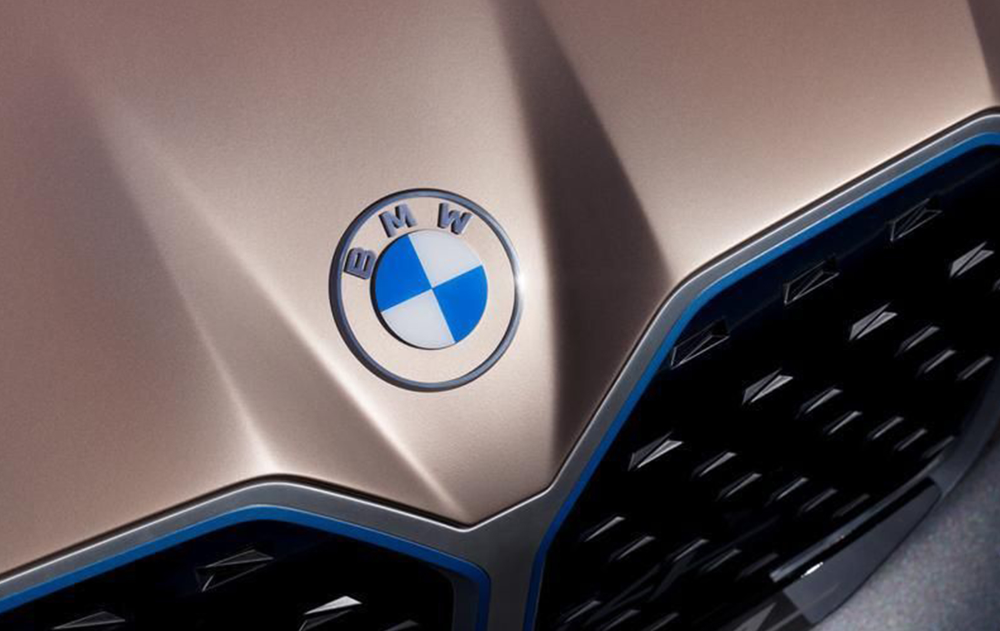
13 Nov Minimalism or excess?
To this day, we remain fascinated by a simple mustache (Nike) or a Yellow M (McDonald's) and wonder how they became such great brands.
The answer is simple.
Just think that the largest companies in the world are often graphically represented by small signs or a few letters...
Leonardo da Vinci quoted that "what is essential is perfect"...clearly, the word essential or minimal can have infinite nuances but the concept is clear.
As early as the 1960s, minimal art took the lead in the radical artistic shift of reality reduction, emotional coldness, and physicality of the work.
Clearly, taking a graphic, a marketing campaign, or a simple brand to extremes also has its upsides and downsides. If we think about the American graphics of signs, sticker companies, and so much more we understand well the difference between what is extreme (graphically) or made minimal.
Is minimalist extremism therefore better?
Some have opted for this choice. Google, for example, has chosen to merge a series of colors (which at first glance can be chaotic) with a rather simple and minimal font, giving birth to a worldwide development brand.
Again, the choice should be left to taste, style, and the message you want to convey.
If the Apple brand had been represented by the image of a beautiful, colorful, richly detailed apple, would it have been as successful?
To posterity the arduous judgment 😉

